Wednesday, April 30, 2008
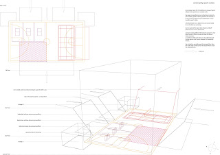
For Neill: Sectional qualities for your Auditoria


Neill- this is the Casa da Musica by OMA in Porto I was discussing yesterday. Maybe you could look in more detail at how the auditorium and ancillary accommodation are packed in to the building. A section and/ or sectional model may be the best way to explore this. The drawings are in an A+U special on OMA from a couple of years back. Good Luck!
Monday, April 28, 2008
Sunday, April 27, 2008
workprogress

that's basically what I'm working on at the moment,
working on a 3d model of the site,
I'm designing it now without the bridge,
This starting point should work as a corridor to the campus
a world inside this old facade, the boxes are floating student galleries and
the path and a platform leading to the old lighttower should lead tourist in there
the two top floors will just work as normal office space which will help the whole building
to get some income through rent.
Thursday, April 24, 2008
Thursday, April 17, 2008
concerns
Drawing day and night somehow got me into, let's say not the best mood.
I finally managed to get a for me satisfying strategy with a sort of campus masterplan which would really work well and regenerate new life in an completely unused area of London.....
BUT! What's my connection to the first term? I just analyzed the whole first term again.
____ floating in different directions on different layers
____ bridging one side with the other
____ unclear but then obvious connections,
____ precipitate and unexpected changes
____ spaces where just the different direction of surfaces define the function
until the section and it's materialization
____ rough inside smooth outside
- london I would say is most of the time more
rough outside and soft inside
So what's the best way to improve my project with these metaphors?
I need to find a way to give my project a massive improvement through that otherwise it will get a normal TU Graz project where I got really nice projects through well done site researches but never had time to do experiments like we did in the first term.
I'm not satisfied with just putting a scaled up version of the laminated model on the site.
For me there has to be a connection with the program, with the surrounding and with the first terms work otherwise it will get what Rem Koolhaas would call Junkspace.
Any ideas how I can avoid that?
How's everyone else dealing with the first terms work?
three way system
Tuesday, April 15, 2008
Initial Sections/plans
Wednesday, April 2, 2008


The idea of this project is to cause a public condenser. The space is generated using parameters as flows, views and infrastructure. The first sketch shows how the space is divided into two parts: the open square (left) and the covered square (right). The first space is a path that articulates a connection in the infrastructures and isolates from the traffic. The plaza is a slope that link east and west with vegetation in one side and twisted paths in the other making possible an underneath connection for the tube (in red). The latter square is a continuous bended ramp generated by means of warping different programmes subject to changes. The programme is guided to arts’ lovers and children but in the same way as a park allows these activities when they are needed. The covered area is defined by two different boundary condition, in one side is the road so the structure is harder and thicker, and in the other side, there is a building and a pedestrian area so materials become softer and opener.
Now I’m drawing these ideas and building a model of the open area to understand how the paths are defining with the difference of height. I’m also defining how light get into the building and how materials are used.
Subscribe to:
Comments (Atom)


.jpg)
.JPG)

.jpg)